Data Analysis
What is changing, and where should you look next?
Profile and clean the data, examine trends and explain the findings with explicit assumptions.
Analysis brief · quality notes · recommendations
DATA ANALYSIS · POWER BI · AI WORKFLOWS
Less time stitching reports together. More time understanding what matters. I help teams turn spreadsheets and disconnected data into useful analysis, clear dashboards and repeatable workflows.
Start with your question and the data you already have.
SOUND FAMILIAR?
Reports take too long to prepare. The same KPI shows different numbers. A dashboard has plenty of charts, but nobody knows what to do next. The starting point is to clarify the decision, the metric and the data behind it.
Find the right support →HOW I CAN HELP
Choose focused support for one problem, or a connected engagement from analysis to handover. Scope, deliverables and commercial terms are agreed before work begins.
What is changing, and where should you look next?
Profile and clean the data, examine trends and explain the findings with explicit assumptions.
Analysis brief · quality notes · recommendations
Make the report useful, not just attractive.
Define KPIs, organise the model and design report pages around the questions users need to answer.
Report files · metric definitions · handover guide
Reduce repetitive work without losing control.
Identify suitable reporting and knowledge-work tasks, prototype an AI-assisted workflow and define where human review is needed.
Workflow prototype · review checkpoints · instructions
Build trust in the numbers behind the dashboard.
Clarify metric ownership, document definitions and identify practical data-quality checks for the reporting process.
KPI register · quality checks · ownership map
INTERACTIVE EXAMPLES
Explore Finance, Sales, Operations and HR dashboards. Filter the period and business scope to see every KPI, chart and table update. All examples use synthetic data—not client results.
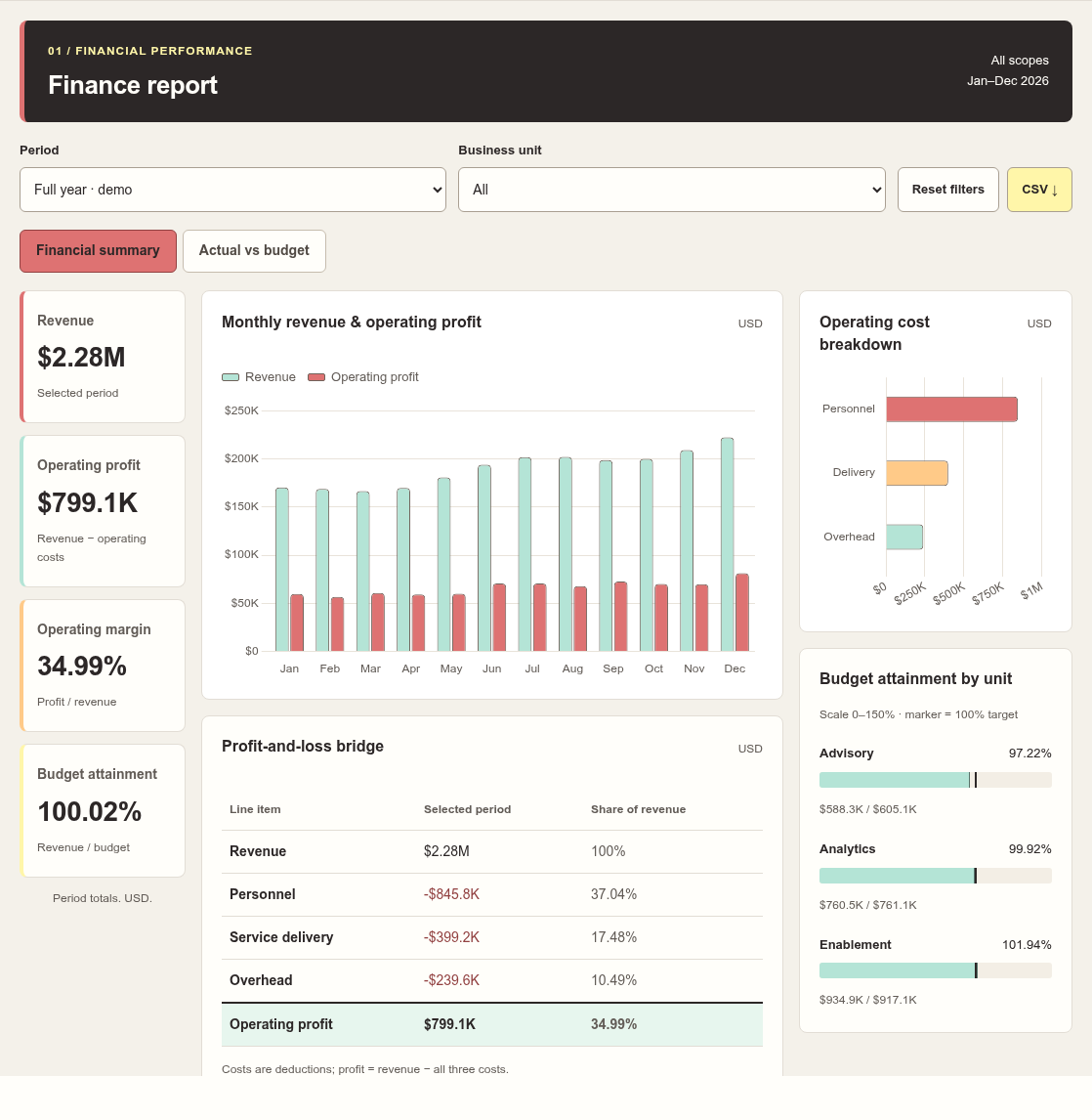
Are we on budget—and what drives profit?
Compare monthly revenue with budget, examine costs and filter by business unit.
Try this dashboard →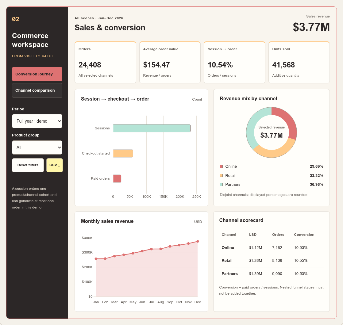
Which channels bring in the most sales?
Explore revenue, orders and average order value by product and quarter.
Try this dashboard →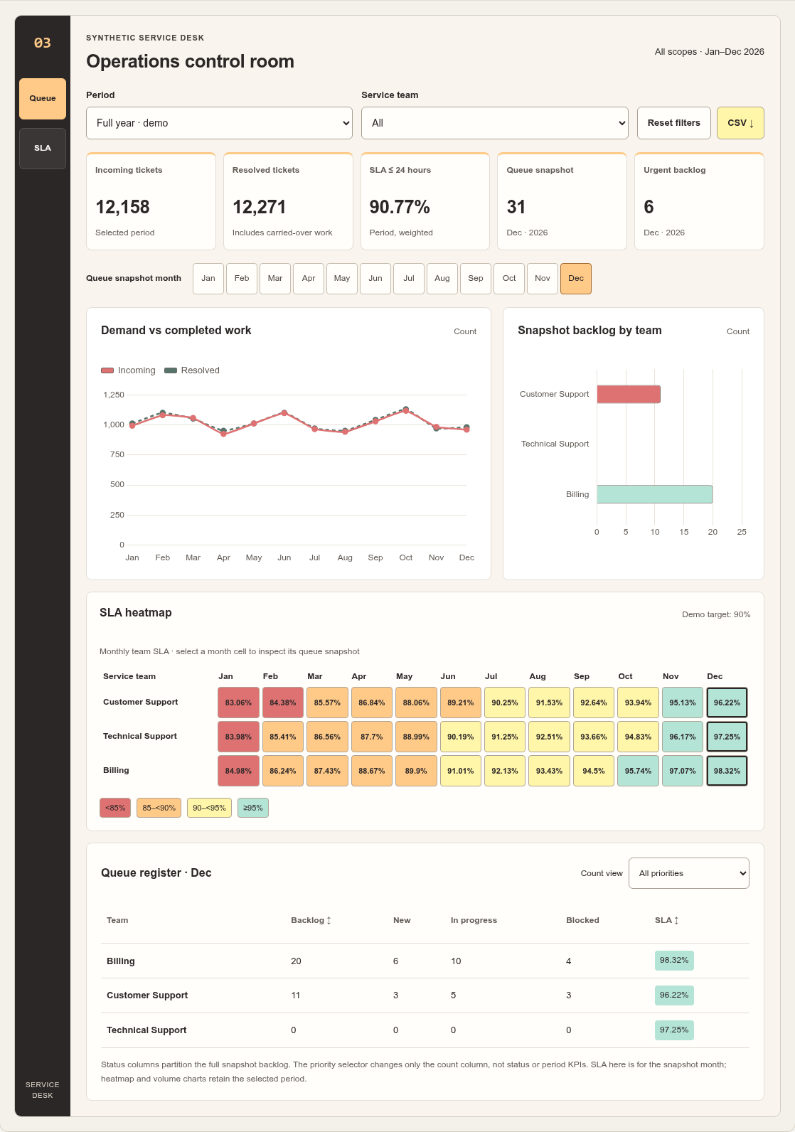
Is the team keeping up with demand?
Compare incoming and resolved tickets, inspect SLA and track the closing backlog.
Try this dashboard →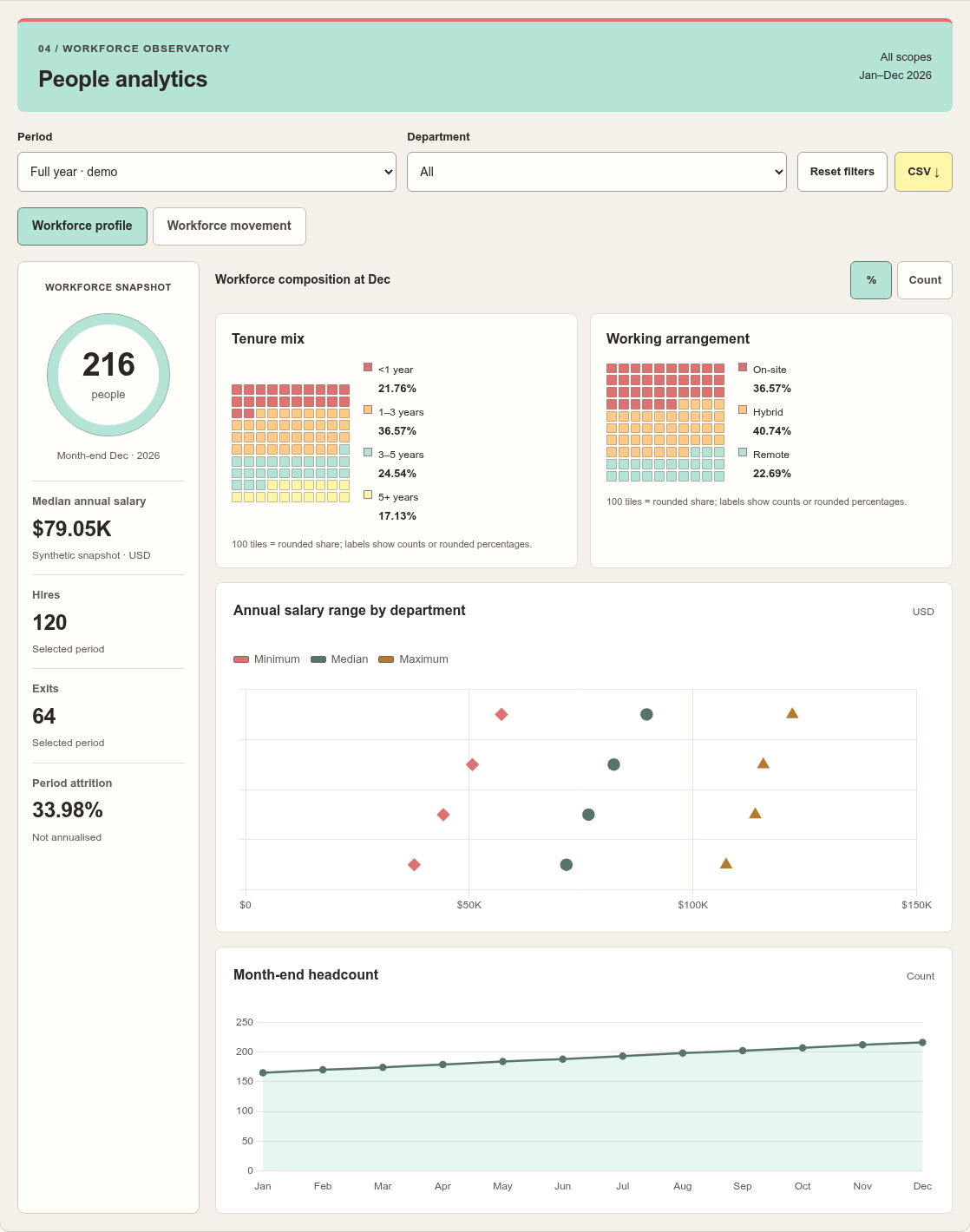
How is the workforce changing?
Inspect headcount, hires, exits and period attrition by department.
Try this dashboard →THE ANALYTICS PLAYGROUND
Change the dashboard, period and scope. Hover or tap the charts for details, open the source table, or export the filtered data. These are offline browser demos, not embedded Power BI reports.
Interactive dashboards use synthetic data only.
HOW WE WORK
Agree the audience, question, scope and success criteria.
Review sources, definitions and data quality before drawing conclusions.
Share a first version, test the core questions and refine with your feedback.
Deliver agreed files, assumptions and usage notes. Confirm any ongoing support separately.
THE PERSON BEHIND THE WORK
My work spans data governance and analytics, Power BI, tax and transfer-pricing technology, and the use of generative AI in knowledge work. The common thread is making complex information easier to understand and use.
I start with the question your team needs to answer, make the assumptions visible, and choose a practical output—an analysis brief, dashboard or workflow—rather than adding technology for its own sake.
BEFORE WE START
No. Start by describing the sources and known issues. Data access, preparation and quality checks can be included in the agreed scope.
They depend on the data sources, complexity, deliverables and review rounds. These are discussed before a proposal is agreed; there is no one-size-fits-all price on this site.
For the first conversation, share a non-sensitive description or anonymised sample only. Agree confidentiality terms and a suitable transfer method before sharing sensitive data.
No. They are browser-based demonstrations using synthetic data. No client names, testimonials or commercial results are implied.
LET’S MAKE THE NEXT STEP CLEAR
Tell me what you need to decide, where your data lives and what you would like to receive. We can then discuss a practical scope and approach.
Discuss your project →contact@nntt-arthur.xyzEmail opens in your mail app. Please don’t send sensitive data in your first message.